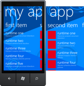
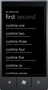
This second blog post on WP7 development will be rather short, showing the characteristics, similarities and differences as well as usage scenarios of both the Pivot and Panorama control.
Personally I like the look & feel of the Pivot and Panorama controls very much. Both give you a UI experience of „several pages“. You can change between those pages with a flick gesture or on the Pivot control by selecting the next page directly. It’s a cool UI and fits perfectly in many mobile usage scenarios.
The Pivot Control
The Pivot control gives you the UI experience of a „tabbed view„, optimized for mobile devices. The pages (= „PivotItems“) are like single tabs. Not all tabs are rendered at once, instead a tab is rendered when a neighbor tab is activated. Thus it’s rendered when you select the tab and the user gets a smooth UI experience. You can change between the tabs with a flick gesture or by clicking the title of the tab.
You can define a background image for the Pivot control as a static image that doesn’t change or move when you switch between tabs.
Usage scenarios of the Pivot Control consist in pages of independent data as well as several tabs as stages of hierarchical data or special filtered views of the same data set. The Pivot control is perfect to show categorized lists of data and to dig into the details of data. It doesn’t need this wide open space like the Panorama control.
The Panorama Control
 The Panorama control gives a user the experience of a continuous view over several pages (= „PanoramaItems“). On the right border of a page you see the continuation to the next page and you can flick between pages back and forth. Unlike the Pivot control, all Panorama items are rendered initially when the Panorama control is loaded.
You can define a Panorama background image on the control that moves while you switch between the pages (as well as the application title). This gives a nice and appealing effect to users.
Usage scenarios of the Panorama control include overview pages like startscreens of your application. It’s like a showroom for your application, which is attracting users to your app. Panorama items are perfect entry points for applications, which summarize or aggregate application features and/or data and simplify navigation through the application. It’s not so good to create dense lists or to show details of data, what should be the domain of the Pivot control. Instead the Panorama control should have space to breath to give the best experience to users and should show just the important information at a central starting point. Furthermore you should not integrate an application bar into a Panorama view (use the Pivot instead).
Finally…
That’s it for today. I hope I could show you some commonalities and differences of both the Pivot and the Panorama control. Both are great controls with a compelling user experience, but slightly different usage scenarios. The key rule should be: Panorama for the coarse, Pivot for the detail.

Nice explanation! Although I have to say I was quite dissapointed by the panorama control. It doesn’t support MVVM style apps because of missing attributes for the selected page. You have to attach the vm to a changed event… how lame is that?! Hopefully they gonna fix that soon. 🙂
Best regards
Gope