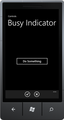
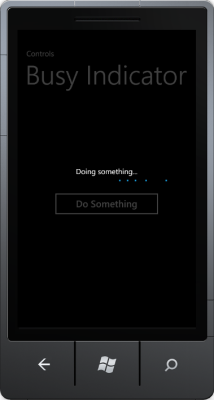
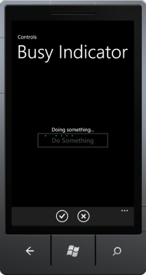
This blog post introduces a Busy Indicator control for Windows Phone 7, which can be driven/defined by XAML and allows binding of the busy state via a ViewModel property. This control can be defined around arbitrary page elements and handles the visibility of the application bar, as well.
Introduction
Indicating the busy state is a common task of applications, that perform many actions asynchronously, while remaining responsive, like Silverlight and Windows Phone applications. It’s up to the developer to show the busy state in dependency of an operation and to disable parts of a page, which should not be selectable/changeable in the meantime. For Windows Phone 7 there are some solutions, but I was surprised that I couldn’t find a satisfying one for me. Either the level of control was inadequate (for example giving users the possibility to change/select controls) or the busy indicator was set/initialized directly from code (code behind/ViewModel), which is more kind of an anti-pattern for me. Thus I decided to look at my favorite busy indicator control for (web-target) Silverlight and to port it to Windows Phone 7.


Structure and usage
My implementation of the busy indicator consists of 2 components: the BusyIndicatorControl as core part and the BusyIndicatorStyle in the Styles.xaml for the layout. The implementation uses the PerformanceProgressBar from the Silverlight for Windows Phone Toolkit (Feb2011 or newer), so make sure you’ve installed it.
The usage of the BusyIndicatorControl is fairly simple. In your XAML just place the control around those controls, which you want to set to „busy“. Bind the IsBusy property to your ViewModel/code behind property, set the BusyText and that’s it! Optionally, with HideApplicationBar you can indicate if you want to show or hide the application bar, when IsBusy==true.
Here’s an example, showing the usage of the control in a simple scenario:
<phone:PhoneApplicationPage
    x:Class="BusyIndicatorControl.MainPage"
    xmlns="http://schemas.microsoft.com/winfx/2006/xaml/presentation"
    xmlns:x="http://schemas.microsoft.com/winfx/2006/xaml"
    xmlns:phone="clr-namespace:Microsoft.Phone.Controls;assembly=Microsoft.Phone"
    xmlns:controls="clr-namespace:BusyIndicatorControl.Controls">

    <controls:BusyIndicatorControl x:Name="busyIndicator" Style="{StaticResource BusyIndicatorStyle}"
                                   BusyText="Doing something..."
			           IsBusy="{Binding IsDoingSomething}"
                                   HideApplicationBar="True">

        <Grid x:Name="LayoutRoot" Background="Transparent">
            <Grid.RowDefinitions>
                <RowDefinition Height="Auto"/>
                <RowDefinition Height="*"/>
            </Grid.RowDefinitions>

            <StackPanel x:Name="TitlePanel" Grid.Row="0" Margin="12,17,0,28">
                <TextBlock x:Name="ApplicationTitle" Text="Controls"
                           Style="{StaticResource PhoneTextNormalStyle}"/>
                <TextBlock x:Name="PageTitle" Text="Busy Indicator" Margin="9,-7,0,0"
                           Style="{StaticResource PhoneTextTitle1Style}"/>
            </StackPanel>

            <Grid x:Name="ContentPanel" Grid.Row="1" Margin="12,0,12,0"
                  Height="550" VerticalAlignment="Top">
                <Button Content="Do Something" Height="80" Width="300"
                    Click="Button_Click" />
            </Grid>
        </Grid>
    </controls:BusyIndicatorControl>

    <phone:PhoneApplicationPage.ApplicationBar>
        <shell:ApplicationBar IsVisible="True" IsMenuEnabled="True">
            <shell:ApplicationBarIconButton IconUri="/Assets/Icons/appbar.check.rest.png" Text="Check"
                                            Click="ApplicationBarIconButton_Click" />
            <shell:ApplicationBarIconButton IconUri="/Assets/Icons/appbar.close.rest.png" Text="Close"/>
        </shell:ApplicationBar>
    </phone:PhoneApplicationPage.ApplicationBar>

</phone:PhoneApplicationPage>
In this case, the whole phone page would be set to „disabled“ by the overlay of the busy indicator control and the application bar would hide, when the IsBusy property is set to true. IsBusy is bound to a property IsDoingSomething in the ViewModel, which controls the visibility and state of the busy indicator. Of course, you can choose the area to disable and change the property values and the style of the control as you want.
Features
This busy indicator includes the following main features:
- Definition on arbitrary parts/controls of a phone page.
- Definition through XAML.
- Control through data binding, e.g. from ViewModel (busy state and text).
- Creates an overlay over controls, that should be updated.
- Option to hide the ApplicationBar, when the indicator is busy.
Sourcecode
Here’s a sample project, which includes the control and shows the usage of the busy indicator. Controls/BusyIndicatorControl.cs and Assets/Styles.xaml is what you need. Please make sure that you’ve installed the Silverlight for Windows Phone Toolkit with at least the version Feb2011. Feel free to change and redistribute the code at will…
I have been working with this for two days now. Is it possible to save this control in a class library? I have tried adding the template to a generic.xaml inside of a themes folder to no avail. I keep „Unknown Parser Error..“ What am I missing?
Thank you for the article. Is there something for the Desktop too? (in order to build metro styled applications „ready for Windows 8“?)
Hi. With „Desktop“ do you mean WPF or Metro-apps with XAML/C#? Currently I’m diving into Win8 Metro and thus I could take a look on this.